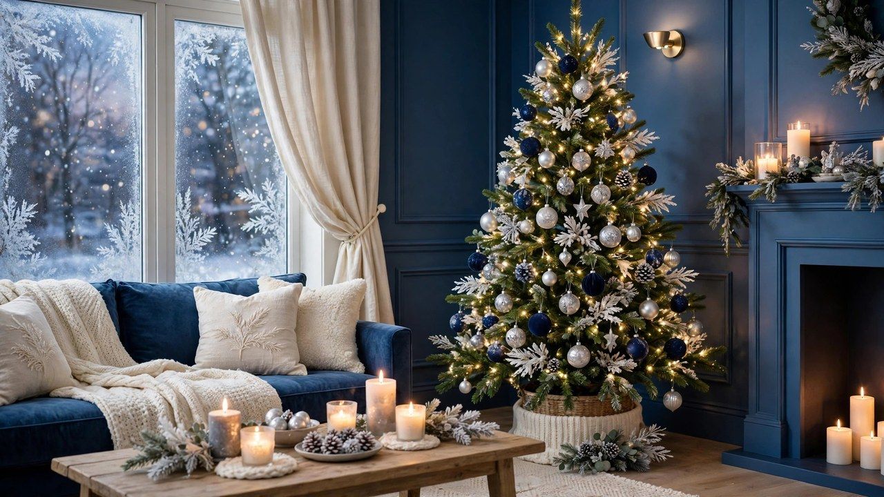
Blue is the color people admire in photographs and hesitate over at home, afraid the room will feel cold. Done well, blue christmas decor is the most elegant look of the season: deep navy like a winter night sky, silver and ice blue like frost at dawn, and enough warmth in the lighting and textiles to make the coolness feel like a choice rather than a chill. This guide shows how the balance works, palette by palette.
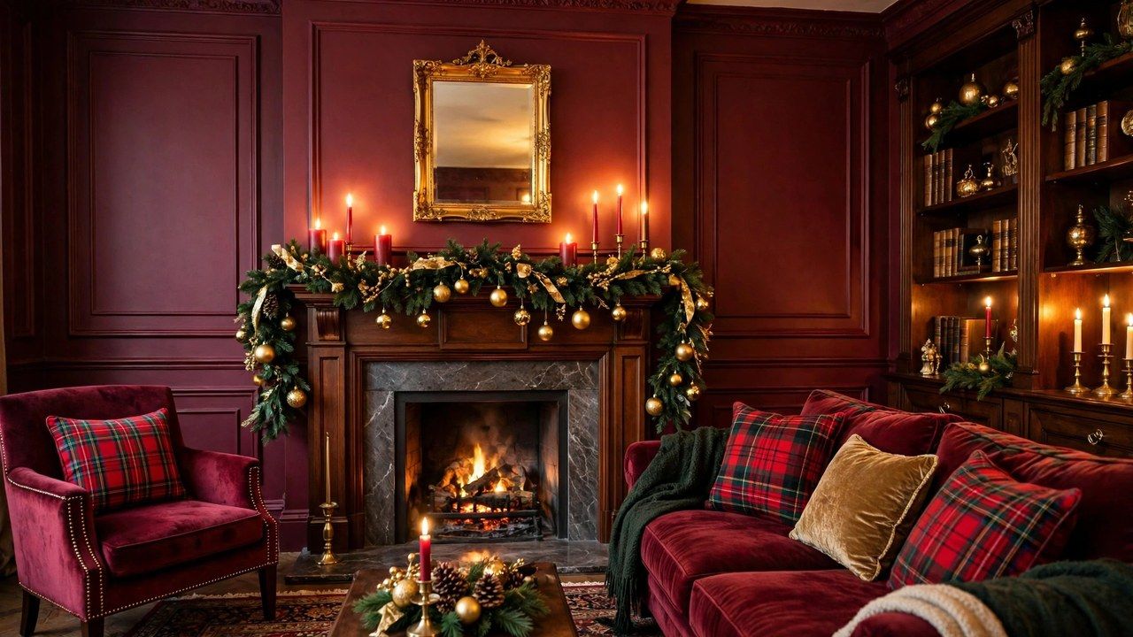
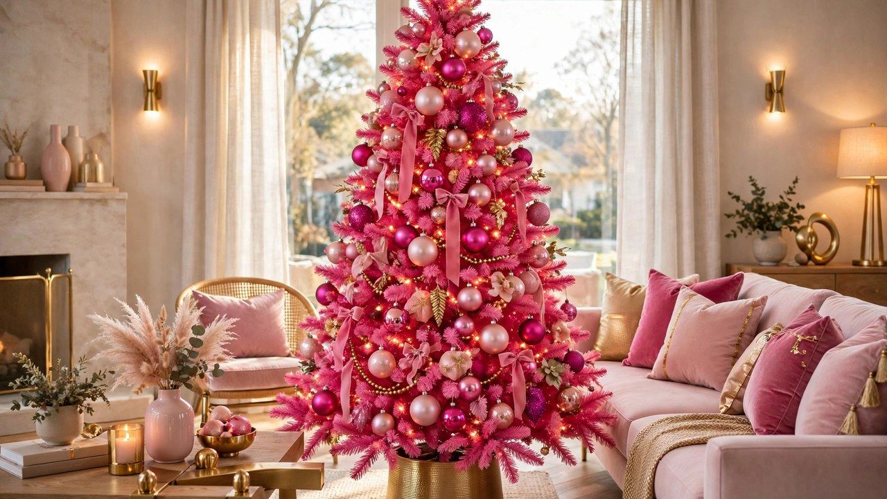
Blue also has range its warmer rivals lack. It can dress a tree for a formal evening, carry a Hanukkah-adjacent winter palette in mixed households with grace, or turn a small room into a quiet, snowy retreat. For the other color stories in this series, compare our pink decor guide and burgundy decor guide before you commit to the cool side.
The Three Blue Palettes That Actually Work
| Palette | Colors | Metal | Mood |
|---|---|---|---|
| Midnight formal | Navy, deep royal, white | Gold | Elegant, evening, dramatic |
| Ice and silver | Ice blue, powder blue, white | Silver | Frosty, bright, serene |
| Coastal winter | Dusty blue, sea glass, sand | Brushed nickel, driftwood | Relaxed, airy, casual |
| Peacock jewel | Teal, sapphire, emerald hints | Antique gold | Rich, artistic, bold |
Two rules govern all four. First, pick one blue as the lead and let the others be relatives, not rivals; navy and ice blue together need white between them to stay calm. Second, choose your metal deliberately, because against blue, gold warms and silver cools, and that single decision sets the room’s temperature more than the blue itself does.
Why Blue Feels Cold, and the Three Fixes
Blue rooms feel cold for physical reasons you can correct. Cool light bulbs push blue toward grey, sparse textiles leave the eye nowhere soft to land, and glossy surfaces reflect like water or ice. The fixes are direct: warm white lights only, so the blue glows instead of greying; textiles in cream, ivory and natural wool at every seat; and matte or brushed finishes for most surfaces, saving shine for small, jewel-like accents.
Warmth also comes from contrast with living green. A blue scheme needs its tree and garlands greener and fuller than a red scheme does, because the green is doing double duty as the room’s warmth and its nature. Skip flocking in a blue room unless you commit fully to the ice palette; a green tree in a blue room is the warmth engine, not a mistake. The layering method in our living room decor guide assembles all of this in order.
The Blue Tree: Ornament Recipes
For the midnight tree: navy and royal ornaments in matte and velvet finishes, white porcelain or glass for light, gold ribbon and a gold star, warm white lights placed deep. For the ice tree: silver, white and pale blue in mixed shine and matte, crystal-look drops, white ribbon, and the only flocked tree that fully earns its snow. For the peacock tree: teal and sapphire with emerald accents and antique gold, kept dark and jewel-like, with ornaments clustered more densely for richness.
Whatever the recipe, hold the classic ratio: roughly sixty percent lead color, thirty percent white or neutral, ten percent metal and surprise. The neutral share is what amateur blue trees miss, and its absence is why they read as themed rather than elegant. Blue ornaments are also famously forgiving in mixed quality: matte finishes hide a thousand sins, and the color carries inexpensive pieces further than red does.
If you are converting an existing red and gold collection, you do not have to start from zero. Keep the gold, retire the red for a season, and buy blue in two finishes only, matte navy and shiny royal, plus a box of white ornaments to supply the neutral third. That staged conversion spreads the cost across two Decembers and, honestly, usually produces a better edited tree than a single-season complete set bought in a hurry.
Room by Room in Blue
Living room: navy cushions and an ice-blue throw on a neutral sofa, the tree as styled above, silver candle holders with cream candles. Dining room: a navy runner or cloth, white dishes, silver and glass, and a low centerpiece of white flowers, blue ornaments in a bowl and greenery. Bedroom: the quietest version, dusty blue and white bedding layers, one silver accent, a small wreath; our bedroom decor guide adapts directly. Entry: a wreath with blue ribbon and silver bells makes the promise the rest of the house keeps.
Blue is also the diplomat of palettes for households blending traditions or tastes: it reads winter more than Christmas-specific in its ice form, which many families appreciate for December gatherings that include everyone.
Children’s spaces take the palette happily too: ice blue with white and silver reads as a snow scene, and a few penguin, polar or snowflake motifs, used the way rustic rooms use woodland figures, sparingly, keep it playful without tipping into a themed bedroom. For a shared kids’ room, keep the blue in bedding and ornaments so January’s reset takes minutes.
Blue and Light: Getting the Glow Right
Evening is when blue decor justifies itself. Navy deepens to near black at the edges of a room, silver catches candlelight, and ice blue holds the last of the daylight in windows longer than any other color. Light the room low and warm: candles in silver or clear holders, warm white string lights, lamps with warm bulbs at seat height. Avoid blue-tinted LED lights, which push the whole scheme into nightclub territory in under a minute.
Test your lighting the way you test paint: live with it for one evening before guests are invited. Sit in the room at dusk with only the tree and lamps on, then with the candles lit, and adjust from the chair you actually sit in rather than the doorway. Blue schemes reward this patience more than any other palette, because their whole effect lives in the hour after sunset.
Daylight needs one check: north-facing rooms already lean blue, so test your palette fabrics at noon before buying in bulk. If the room greys out, shift toward the midnight palette with gold, which holds its warmth under cool daylight, rather than the ice palette, which surrenders to it.
Styling Mistakes That Sink a Blue Room
The classic errors: mixing silver and gold evenly so neither warms nor cools with intent; using cool white bulbs and wondering why the room feels like an office; flocking the tree, whitening the textiles and icing the ornaments until no warmth source remains; and adding red “for tradition,” which against navy reads as a flag rather than a festival. If you want a red note in a blue room, burgundy, used once and deeply, is the only version that behaves.
Honest pros and cons: pros are elegance, distinctiveness, calm, and ornaments that transition to New Year’s Eve without changing a thing. Cons are the constant warmth management, less forgiving light requirements, and a smaller pool of ready-made decor in shops, which still stock red and gold deepest. Blue households shop earlier in the season and keep their finds for years, which suits the palette’s timeless character anyway.
Conclusion
Blue Christmas decor is icy only when you let it be. Choose one blue, warm it with gold or cool it with silver on purpose, keep lights warm and textiles cream, and let a very green tree anchor the room. The result is the season’s most elegant palette, and, unexpectedly, one of its coziest.