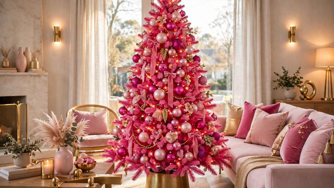
Pink is the color story nobody expected to take seriously and everybody ended up photographing. Named by trade reports as a defining aesthetic of the season, pink christmas decor ranges from whisper soft blush that behaves almost like a neutral to full confidence hot pink that turns a tree into a landmark. This guide shows how to do the season’s boldest color well: which pinks pair with which metals, how to keep pink festive rather than nursery, and how to test the look in one room before committing the whole house.
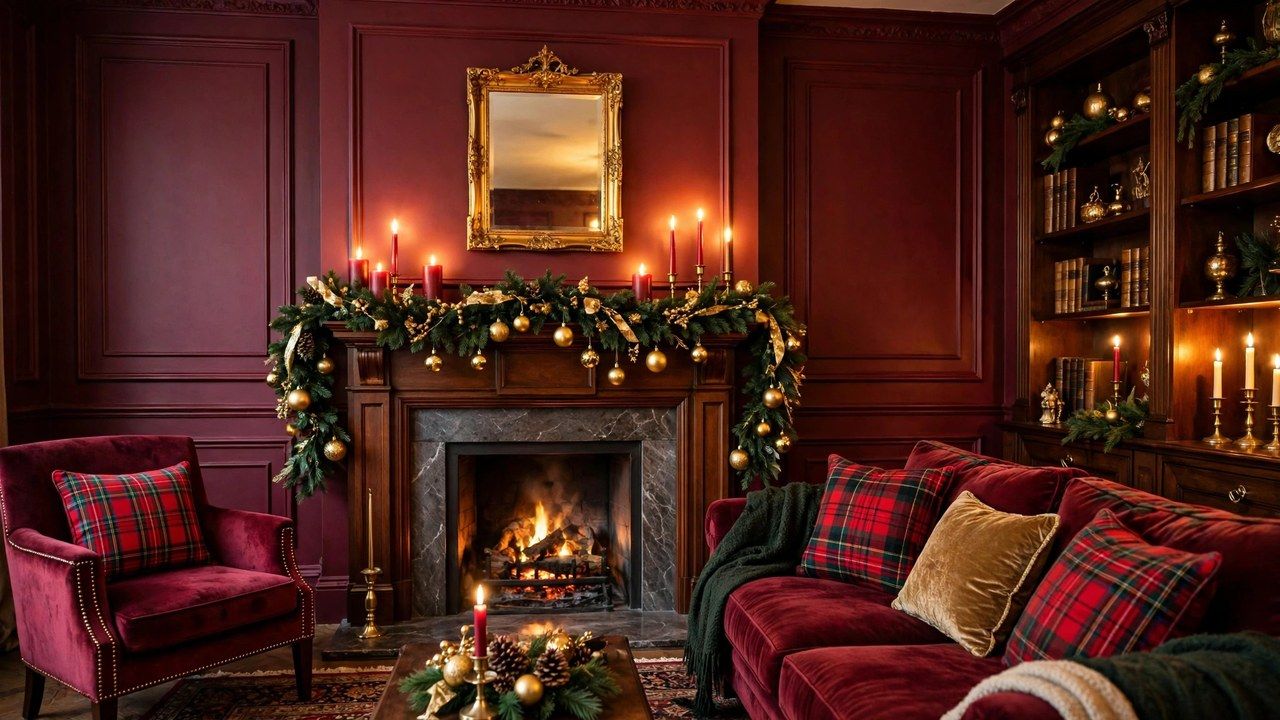
Pink works because it is red’s joyful relative: the warmth of the traditional palette, pushed toward playfulness. It also plays surprisingly well with the classics, as our burgundy decor guide shows from the deeper end of the family, and it can be dialed from a single pink ribbon to a full pink tree. Start with the shade decision, because in this look, shade is destiny.
Choosing Your Pink: Blush, Rose, Magenta or Hot Pink
Blush is the entry point: pale, dusty and calm enough to replace cream in a traditional scheme. Blush pink pairs with gold, champagne and ivory, and it suits anyone who wants the trend without the volume. Rose and dusty pink sit in the middle, romantic and vintage leaning, beautiful with antique gold, pearl and sage green. Magenta and hot pink are the bold commitment: saturated, modern and unmistakably deliberate, best with white, silver or sharp black accents to keep them graphic rather than sweet.
The practical rule: pick one pink as your lead and let other pinks appear only as its close relatives. A blush scheme muddied with a random hot pink cushion looks accidental, while a hot pink scheme with one magenta ribbon reads intentional. Hold fabric and ornaments together in daylight before buying in quantity, because pink shifts more under warm evening light than almost any other color.
Pairings That Keep Pink Festive, Not Nursery
Pink turns childish when it is paired only with white and more pink, in flat matte finishes, with nothing grown up in the mix. The fixes are contrast and texture. Add a deep anchor: burgundy, forest green, navy or charcoal in a throw, a ribbon or the tree skirt, and the pink instantly reads sophisticated. Add an adult material: velvet, satin, glass, feathers or metallics, and the scheme gains the luxury cues that separate a styled room from a themed party.
Metal choice steers the mood. Gold warms pink into glamour, silver cools it into a winter candy shine, and rose gold doubles down on romance but risks sweetness overload, so use it sparingly. Green is pink’s secret weapon: deep green foliage against pink ornaments is one of the freshest combinations of the season, which is why a real green tree dressed in pink often beats a pink tree for first timers. Our tree decorating guide covers the ornament ratios to use.
The Pink Tree: Full Commitment vs the Pink Dressed Tree
There are two honest routes. Route one is the pink tree itself: blush, ombre or full pink artificial trees that act as furniture scale statements. They photograph spectacularly, need very little ornament to look complete, and suit modern, glam and playful households. Their costs are storage, commitment and palette lock in: a pink tree decides every other color in the room for years. Route two dresses a classic green or white tree in pink: ornaments, ribbon, floral picks and a pink tree skirt. It delivers ninety percent of the effect, stores in a single box, and can evolve next year.
For most homes, route two is the smarter first year. If the pink dressed tree still thrills you in January, promote yourself to the full pink tree next season with confidence. White trees deserve a mention too: pink on white reads like spun sugar and light, and suits small bright rooms where a green tree would go visually heavy. See our artificial tree buying guide for shapes and sizes before you choose.
Room by Room: Where Pink Lands Best
The living room takes the full treatment because it holds the tree, the textiles and the audience. A bedroom is pink’s most natural second home: blush bedding layers, a small pink dressed wreath and rose toned candles create a retreat that feels festive without shouting, as our bedroom decor guide demonstrates. Entryways make an excellent test zone: a pink bow on the wreath and a pink runner announce the theme to guests in one glance, and our front door guide shows the placement.
Kitchens and dining rooms suit pink in doses: pink glassware, napkins and a centerpiece keep food spaces appetizing, since large pink wall scale color near food can feel odd to some guests. Bathrooms, surprisingly, are where a small pink tree or a set of pink towels delights everyone. The principle everywhere is the same: pink leads in one or two places per room and supports elsewhere.
Ornaments, Ribbon and Textiles: Building the Layers
Build pink in three layers for depth. The base layer is textile: cushions, a throw, a tree skirt or a table runner in your lead pink, ideally in velvet or satin so light moves across it. The middle layer is ornament: balls and shapes in two or three pink tones plus your metallic, distributed with the largest pieces deepest in the tree. The top layer is sparkle and detail: pink ribbon, beaded garland, floral stems like poinsettia or roses in pink, and one or two statement pieces, a large bow or a cluster of pink feathers at the top.
Oversized bows are pink’s best friend this season; a single huge velvet bow on the tree, wreath or mantel delivers the trend in one gesture, a trick explored fully in our oversized bows trend guide. Keep finishes mixed, matte, shiny and glitter in roughly equal thirds, because a single finish in a single pink is what flattens the look into plastic.
Pink for Traditionalists and Pink for Maximalists
Traditionalists can adopt pink as an accent inside a classic scheme: keep the red and green structure, and swap a third of the red for blush and rose. The result reads as a softer, more romantic classic, and family ornaments still belong. This is also the safest route for shared households where one person loves the trend and another fears it, because nothing structural changes and every pink piece can be retired in one box.
Maximalists should lean into abundance with rules: pink in several tones, pattern through ribbon and wrapping paper, pink lighting gels or pink toned fairy lights for evening, and mirrored or iridescent surfaces to multiply the effect. The discipline that saves maximalism is repetition: repeat each pink at least three times in a room and it looks curated; use it once and it looks lost. Gift wrap is the cheapest maximalist tool, since a floor of pink wrapped gifts extends any scheme instantly.
Honest Pros, Cons and the January Test
Pros: pink is joyful, photogenic and genuinely fresh after years of farmhouse neutrals; it flatters warm lighting and skin tones in photos; and blush versions will still look elegant when the trend cools. Cons: saturated pink dates faster than classic colors, cheap pink plastic looks cheaper than cheap red or gold equivalents, and pink can clash with existing warm wood and orange toned rooms if you do not test first.
Apply the January test before big purchases: will this piece work as Valentine’s or spring decor, or in a girl’s bedroom refresh? Pink textiles and ornaments often pass easily, which softens the cost per use. The full pink tree is the one purchase to make slowly, ideally after a successful pink dressed season proves the household loves living with the color.
Conclusion
Pink Christmas decor succeeds when it is chosen like a designer, not a dare: one lead shade, a deep anchor color, grown up textures like velvet and glass, and repetition until the room believes it. Start with a pink dressed tree or a single room, live with it through the season, and let January tell you whether pink was a fling or your new tradition.