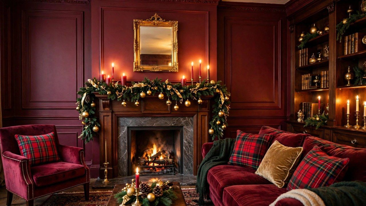
Burgundy is what red grows up to be. Where bright red shouts celebration, burgundy speaks in a lower, richer voice: wine, oxblood and claret tones that make a room feel warmer, older and more expensive than it is. Classic holiday guides this season build their core palette on burgundy with tartan, dark greens and gold, and this guide to burgundy christmas decor shows how to layer the color story from tree to table, including a candlelit accent in the picks section below.
Burgundy also forgives. It flatters warm wood, leather and brick, hides the wear on inherited ornaments, and pairs with almost every classic Christmas element you already own. If the heritage direction appeals, our heritage tartan decor guide is burgundy’s closest stylistic relative, while our general decoration ideas show where this palette sits in the wider season.
Why Burgundy Reads as Instant Classic
Burgundy borrows its authority from wine cellars, library bindings and theatre curtains: places associated with ceremony and depth. In a Christmas room it lowers the visual temperature of red’s excitement into something closer to glow. That makes it the easiest dramatic color for beginners, because burgundy can cover large areas, a whole tree’s ornaments, a full set of chair cushions, without becoming loud the way bright red or fuchsia would at the same volume.
It is also a bridge color. Burgundy connects red to brown, pink to plum and green to gold, which is why it rescues mixed collections: ornaments from different decades and sets suddenly look related when burgundy ribbon and textiles run through them. If your decor box is a beautiful mess of eras, burgundy is the editor that turns it into a scheme.
The Supporting Palette: Green, Gold, Cream and Tartan
Burgundy should rarely perform alone. Its classic partners are deep forest green, which shares its saturation and keeps the scheme unmistakably Christmas; antique gold, which supplies the light; and cream or ivory, which gives the eye rest and stops the room going cave dark. Tartan in the same family, especially patterns carrying burgundy, green and gold threads, acts as the scheme’s patterned member, appearing on cushions, ribbon or a throw rather than everywhere.
Dosage is the craft. A workable room ratio is green as the field, burgundy as the lead accent at roughly a third of visible color, gold as a tenth for sparkle, and cream threaded through in candles, stockings and ceramics. Break the ratio deliberately only at the table, where burgundy linen can lead. Our table settings guide shows that table first version beautifully.
The Burgundy Tree: Deep, Warm and Generous
Start with a full green tree, because green is burgundy’s best backdrop; a flocked tree works too, its white softening burgundy into romance. Dress it in layers: burgundy velvet ribbon first, worked in vertical drops or large loops, then ornaments in burgundy, gold and deep red mixed, with the largest burgundy pieces placed deepest for shadowed richness. Add texture ornaments, velvet balls, beaded fruit, and tassels, because burgundy’s luxury lives in matte and plush finishes more than shine.
Lighting decides whether burgundy glows or sulks. Warm white lights are non negotiable; cool white turns burgundy muddy and brown. Test a branch in evening light before dressing the whole tree, a tip that applies to every deep palette in our tree decorating guide. Finish with a gold or burgundy star or a large bow, and a tree skirt in burgundy velvet or tartan to anchor the floor.
Mantel and Table: Where Candles Do the Talking
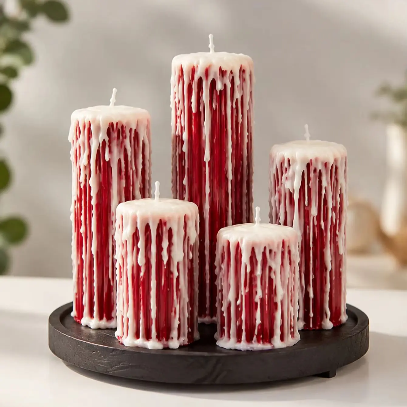
Burgundy was made for candlelight, and the mantel is where the two meet. A deep green garland, burgundy ribbon woven through it, brass or gold holders, and candles in cream and wine red create the classic composition. This is exactly where the candle set in our picks section belongs: its wine red candles were matched to this guide because they carry the palette onto a mantel or table as a genuine accent, glowing against green garland and gold holders. Never leave candles burning unattended, keep them clear of garland foliage, and use stable holders on heat safe surfaces.
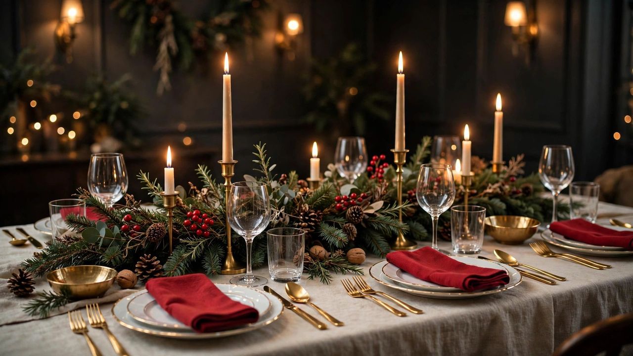
At the dining table, burgundy can take the lead: a burgundy runner or linen, cream china, gold toned cutlery if owned, greenery low and loose, and candles at varied heights down the center. Burgundy napkins against cream plates give each guest the palette in miniature. Keep centerpieces below eye level for conversation, and let the candle set’s wine red tone repeat in ribbon or napkin rings so the accent feels designed, not dropped in. More place setting detail lives in our mantel decor guide for the room’s other focal point.
Textiles and Small Rooms: Burgundy Without the Cave Effect
Textiles are burgundy’s fastest delivery system: velvet cushions, a wool throw, stockings and a table runner can convert a neutral room in an afternoon. In small or dark rooms, fear of the cave effect is valid but manageable. Keep walls and the largest furniture light, use burgundy in the middle layer only, cushions, throws, ornaments and candles, and add mirrors or metallics to bounce the warm light you have. Our small apartment guide applies the same dosing logic at studio scale.
Bedrooms take burgundy beautifully in bedding layers, where its warmth suits sleep; see our bedroom decor guide for a full layered scheme. In hallways, a burgundy runner and a wreath with burgundy ribbon give guests the theme in the first five seconds, a trick that costs little and photographs like a magazine.
Burgundy With Tartan, and Burgundy With Pink
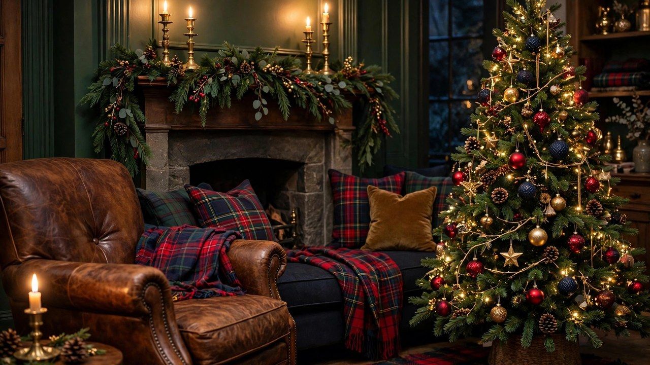
Tartan is burgundy’s oldest friend. A classic tartan carrying wine, green and navy threads lets you introduce pattern without a single new color decision, and it pulls the room toward the heritage mood described in our tartan guide. Use tartan where hands touch: cushions, throws, stockings and napkins, and keep burgundy solids in the large quiet areas around them.
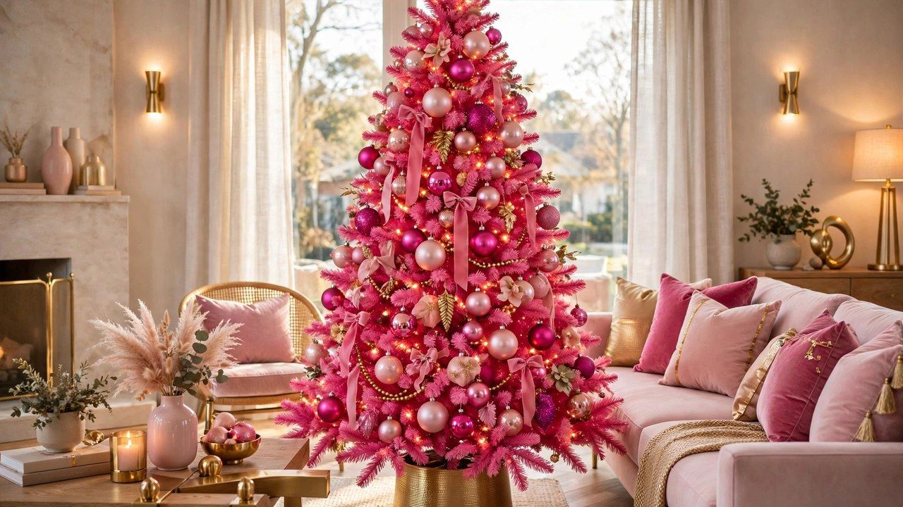
The newer friendship is burgundy with pink. Blush and rose soften burgundy’s formality, while burgundy gives pink the grown up anchor it needs, a pairing explored from the other direction in our pink Christmas decor guide. If you mix them, let burgundy lead and pink visit: burgundy textiles and ornaments, pink in ribbon, flowers and a few glass ornaments for lift.
Honest Pros, Cons and Buying Advice
Pros: burgundy is timeless rather than trendy, flatters existing classic decor, photographs warmly, and ages gracefully into January and even Valentine’s styling. Cons: it darkens small or north facing rooms if overdosed, it shows dust and lint on velvet more than mid tones, and under cool lighting it can turn muddy, so your bulbs matter as much as your ornaments.
Buy in this order: ribbon first, since burgundy ribbon threads tree, wreath, mantel and gifts into one story for the least money; textiles second; candles and holders third; ornaments last, filling gaps your existing collection leaves. Choose velvet and matte finishes over shiny where you can, keep receipts until the tree is dressed, and store burgundy textiles out of sunlight, because deep reds fade faster than any other Christmas color.
Conclusion
Burgundy is the rare dramatic choice that is also the safe one: rich enough to transform a room, classic enough to never embarrass you in next year’s photos. Give it green to lean on, gold for light, cream for air and candlelight for its finest hour, and you have a color story that feels less decorated than inherited.